Wedding Stationery Portfolio

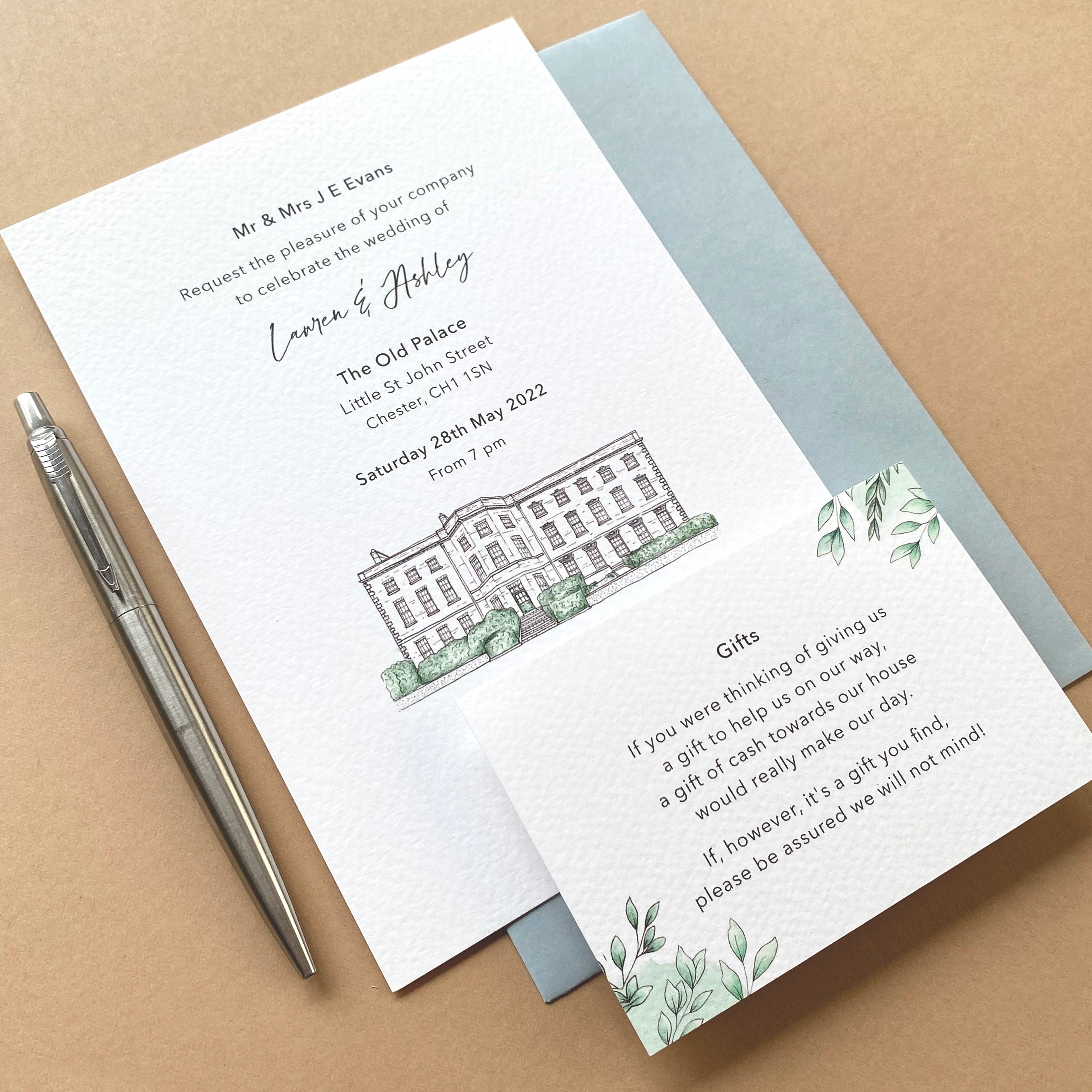
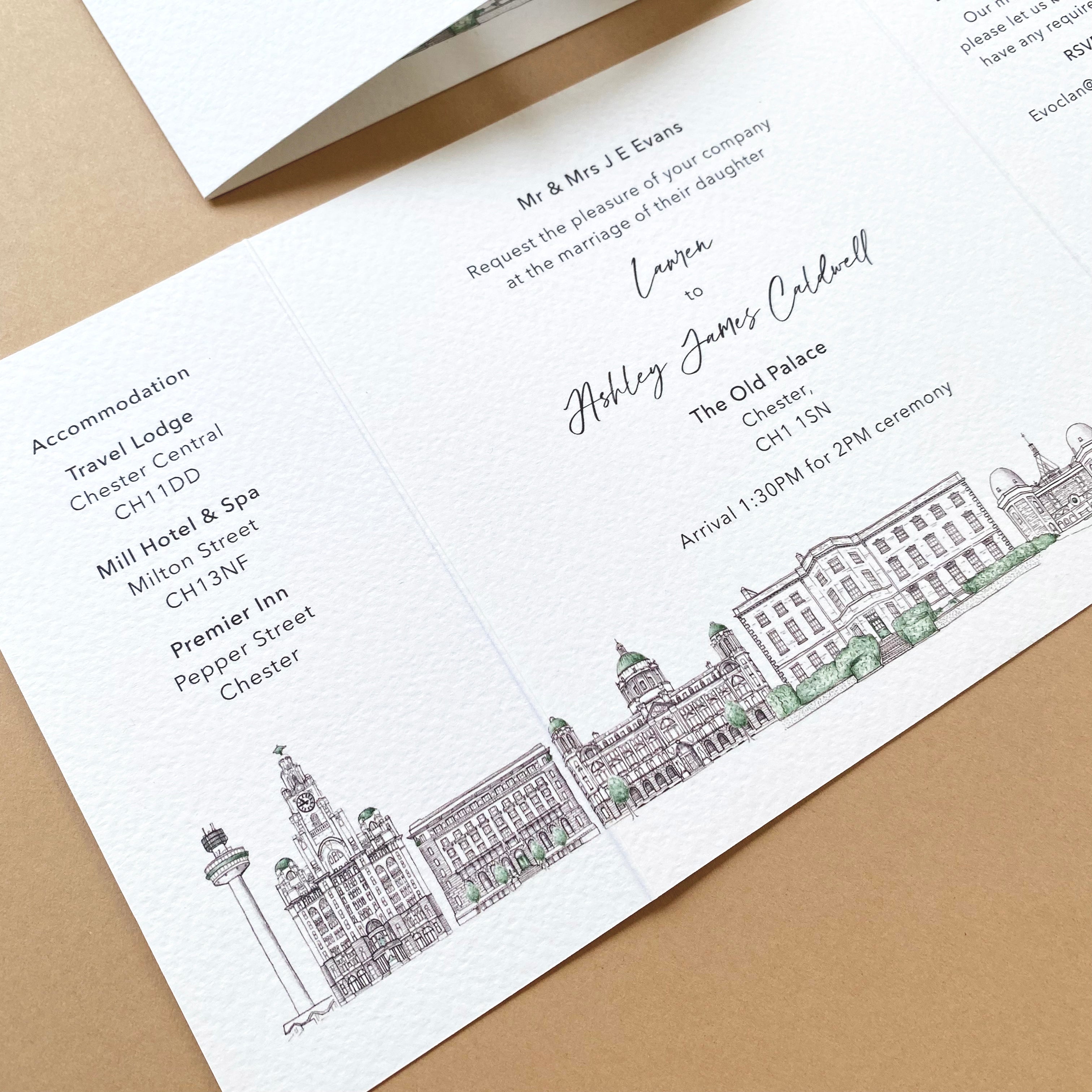
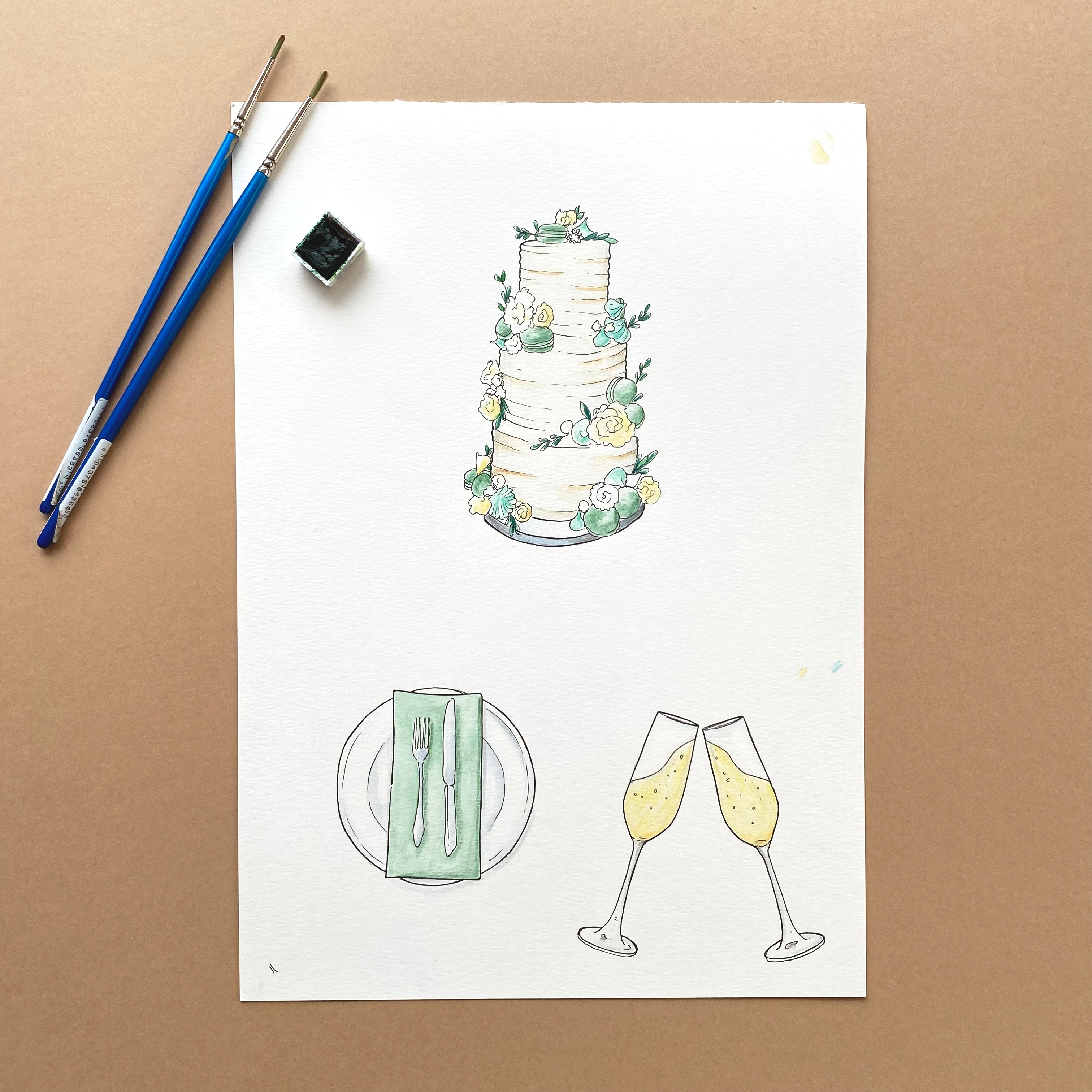
Below are some examples of the previous wedding stationery designs that I have created to give you a feel for my work, the style and hopefully help to inspire you when thinking of your own designs and how my illustrations can work across all the different elements you might want included in your own wedding stationery.
I try not to share any specific details or give too much away of designs I've worked on untill after each couple's special day, so for that reason not all of my designs are featured on my website. However, if you wish to see further examples of my work or arrange a meeting to discuss ideas please send me a message via my Contact page.
You can also keep up to date with my latest designs via my dedicated wedding stationery account: wedding.stationery.by.chris.
Alexandra & Alastair
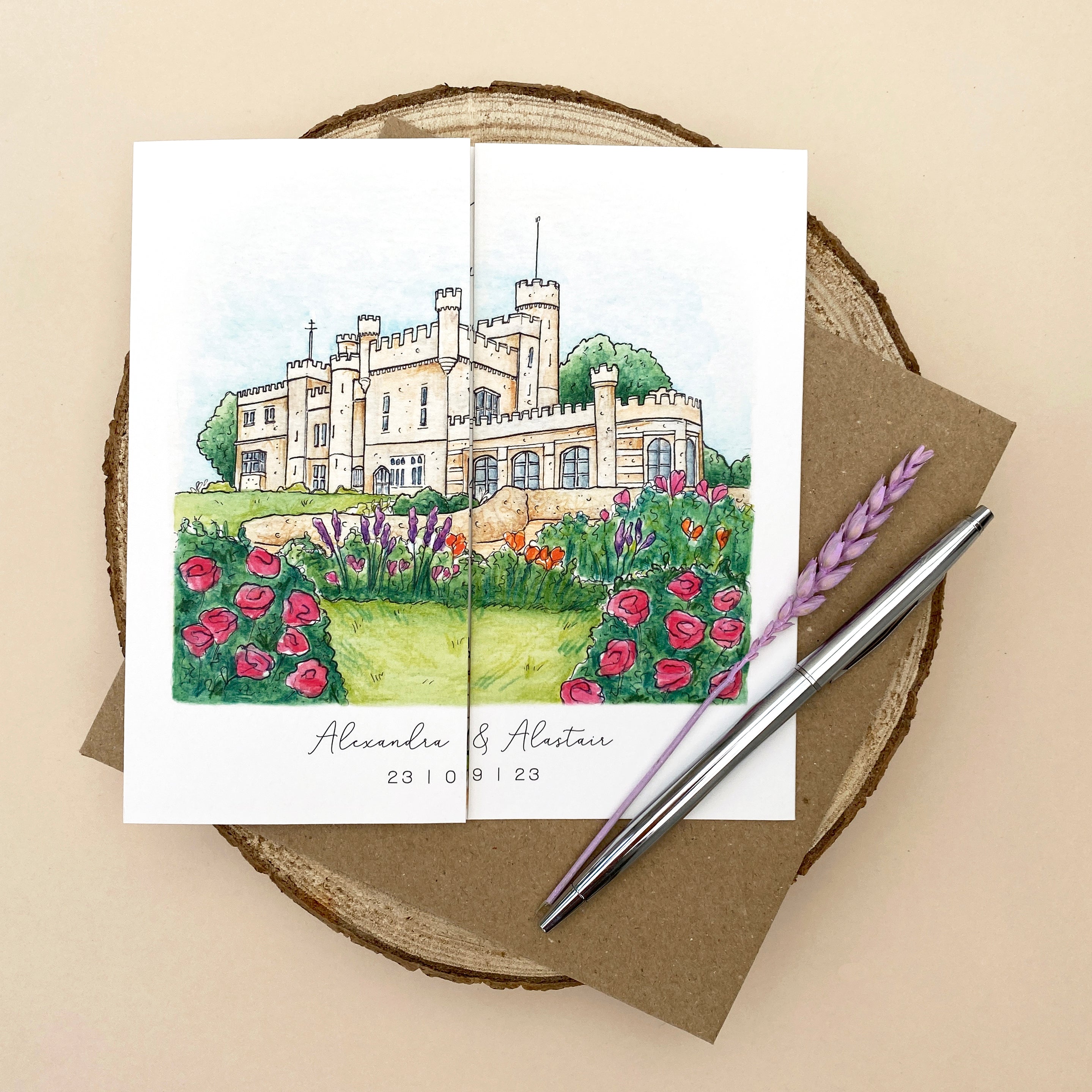
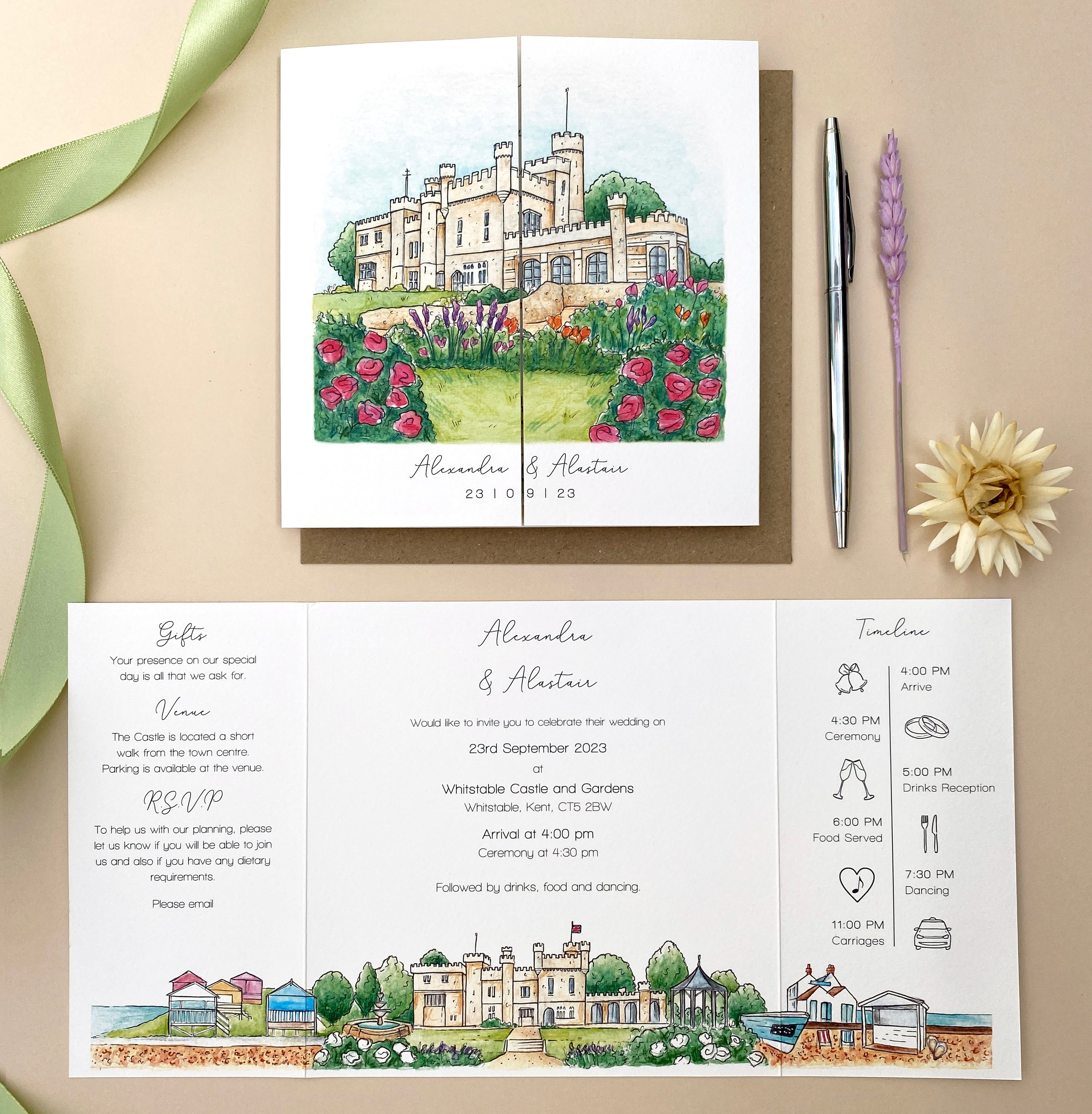
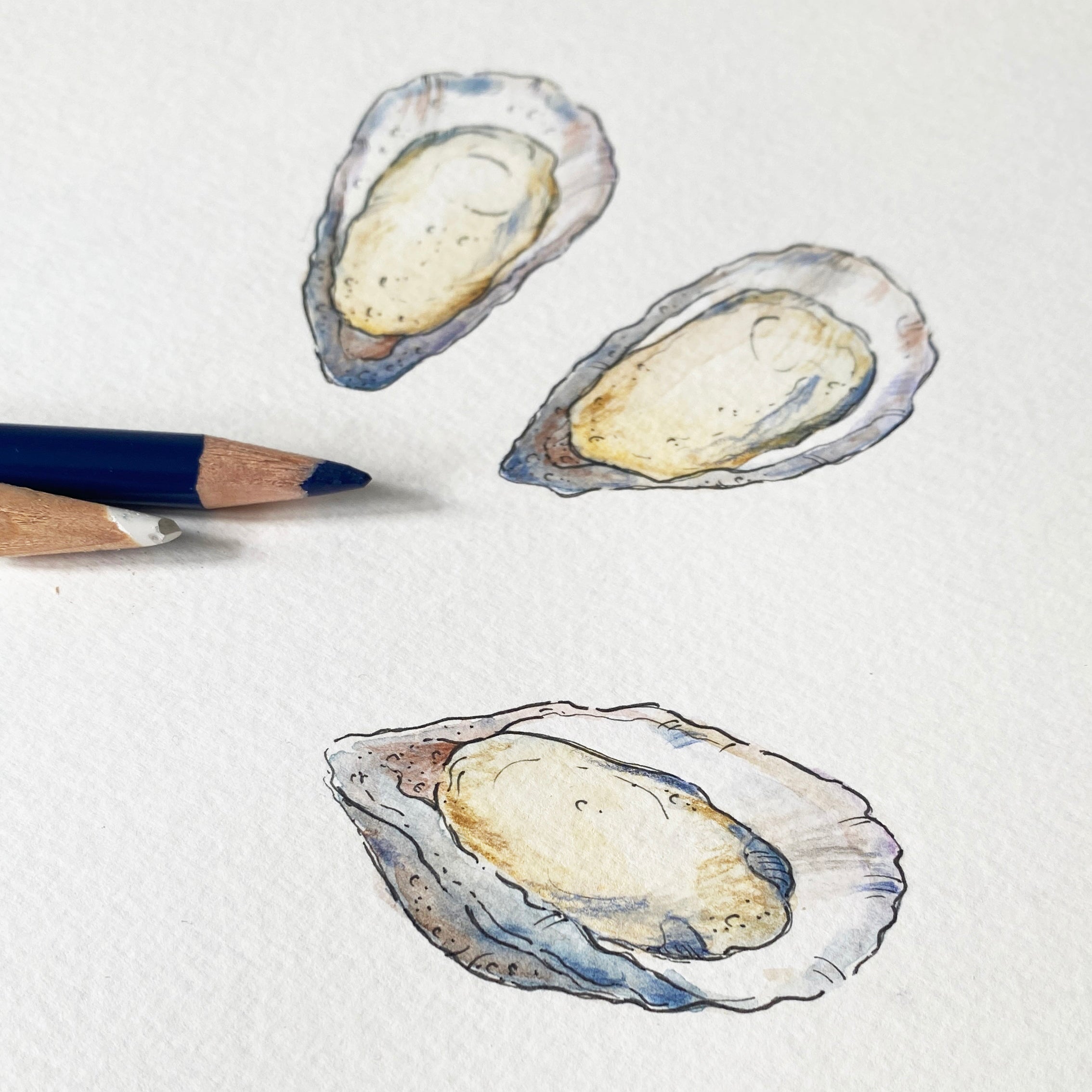
Gate-fold wedding invitation, featuring a venue illustration of Whitstable Castle and the gardens with flowers to match their colour scheme on the outside that opens out to reveal the details of Ali and Alex's wedding, a timeline for the day and a scene featuring there favourite local landmarks to Whitstable.
These invites were printed on a textured paper stock that works beautifully with my watercolour illustrations and paired with a simple brown kraft envelope to give a rustic feel.
Cat & Thurston
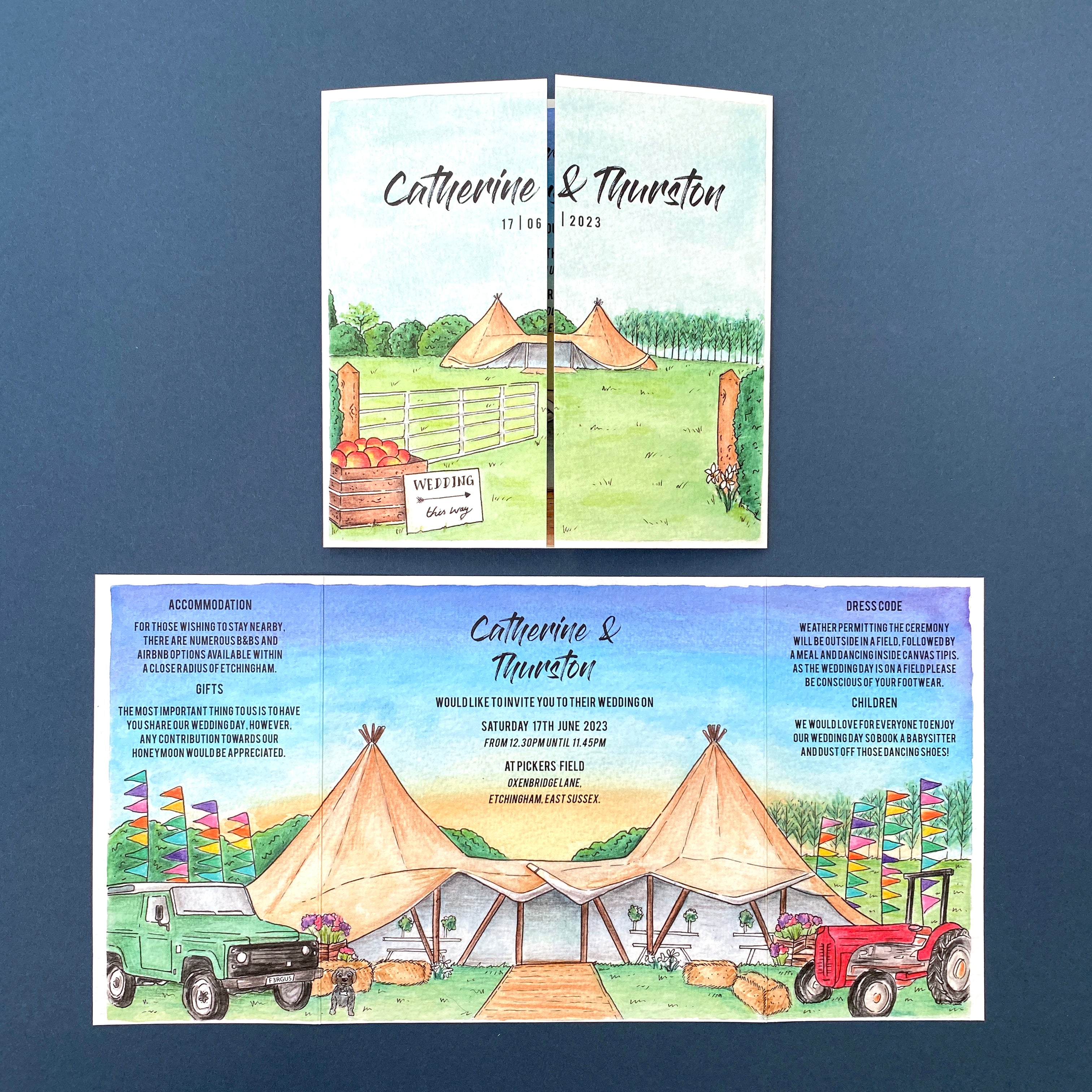
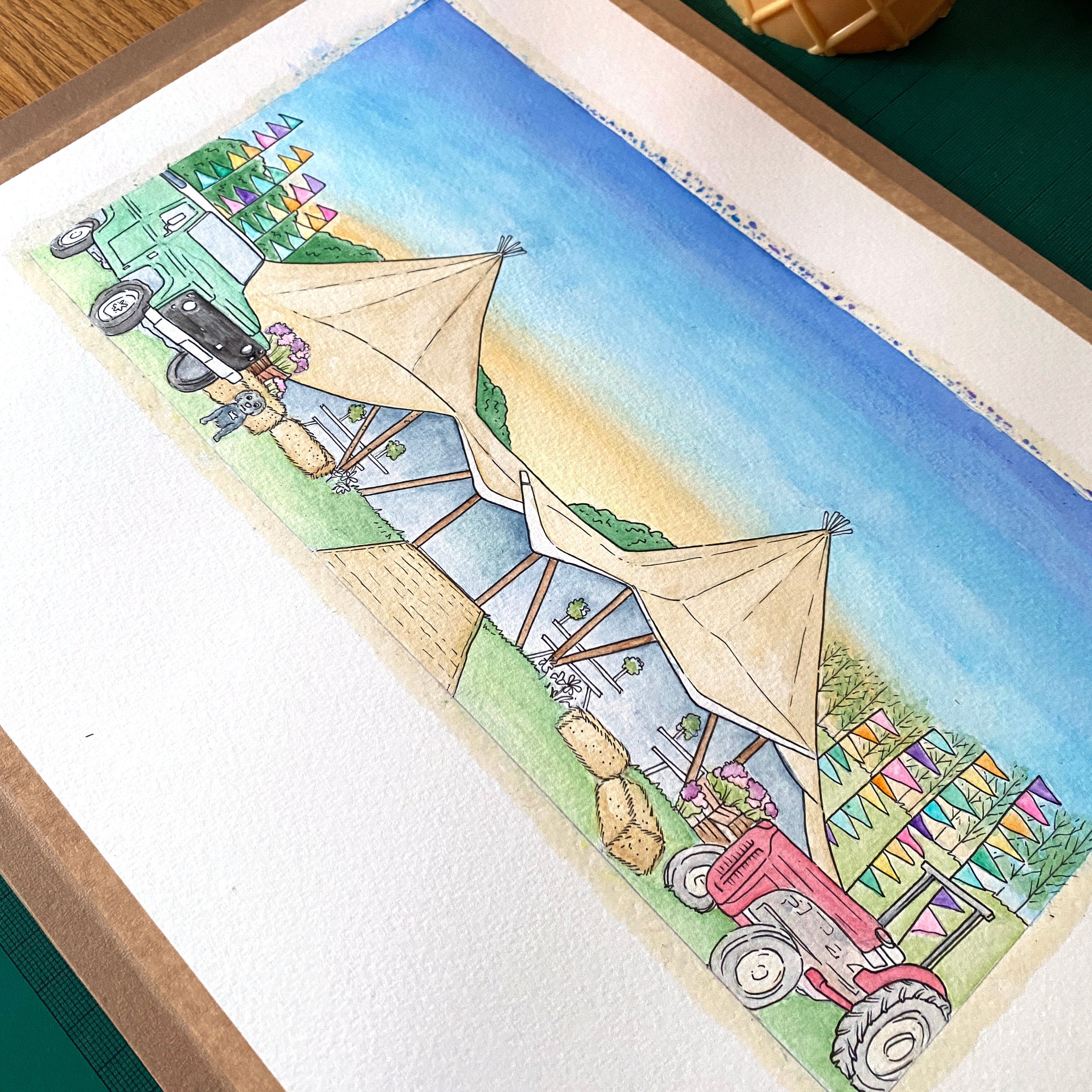
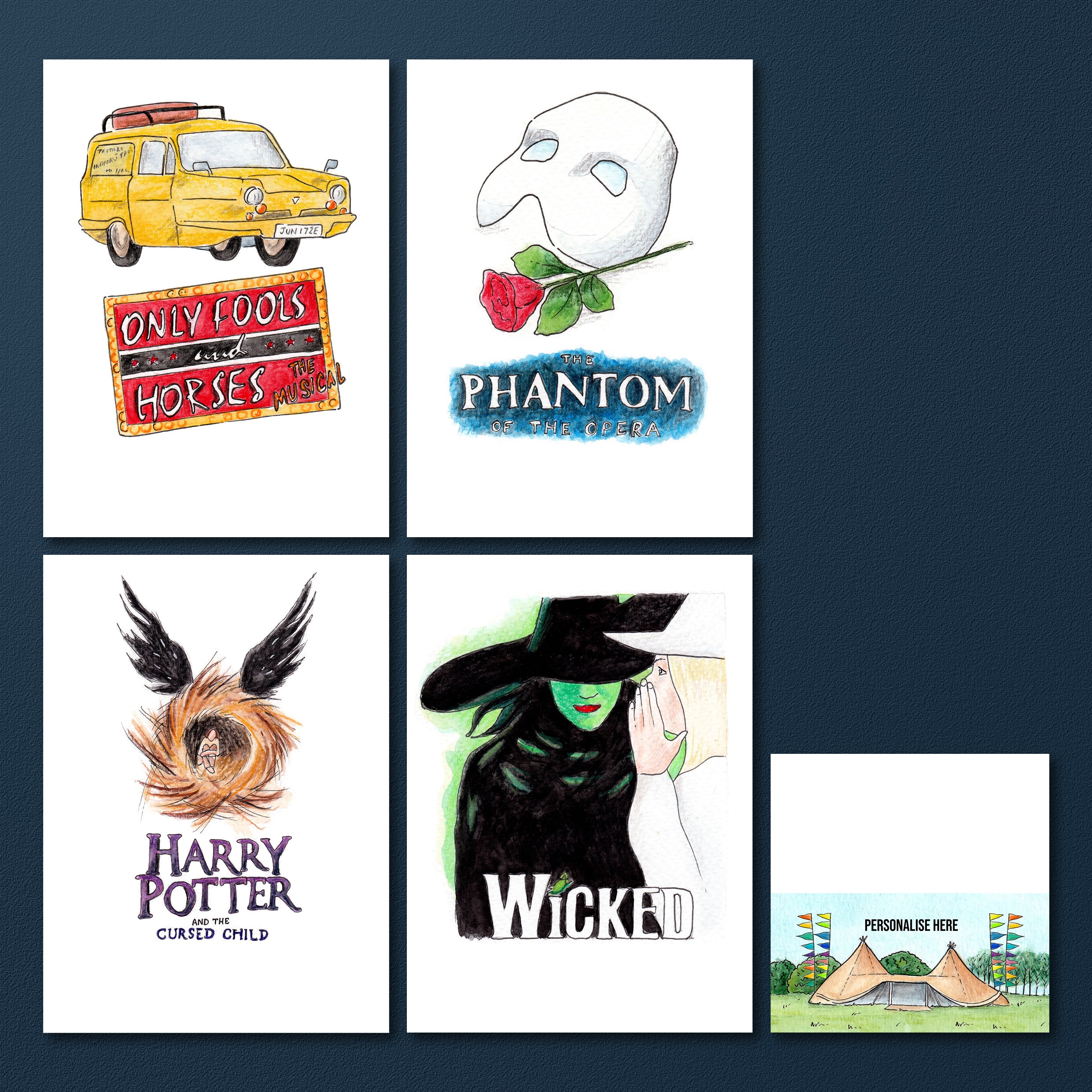
Cat & Thurston’s Save the Dates & Invitations are some of my favourites ones I’ve ever created because they had such a clear narrative on the story they wanted to share and they are full of personal touches.
Their wedding was set on the bride’s family farm where she grew up, so the design features lots of personal details, such as the tractor and the apples.
The Save the Date is an illustration of the empty field where the wedding was taking place and the final invitation featured the same scene on the outside with a tipi in the distance, that opened out to reveal all the details and colour of the festival themed wedding they had planned for their guests.
There are personal touches throughout their stationery, from their pet dog Fergus to the lilies by the gate.
As a couple they love going to see different theatre shows and performances which they wanted to theme their table plan around, so I illustrated eight of their favourite shows, one for each table, along with designing place cards, menus and an order of service in line with their themes for the day.
Ian & Lydia
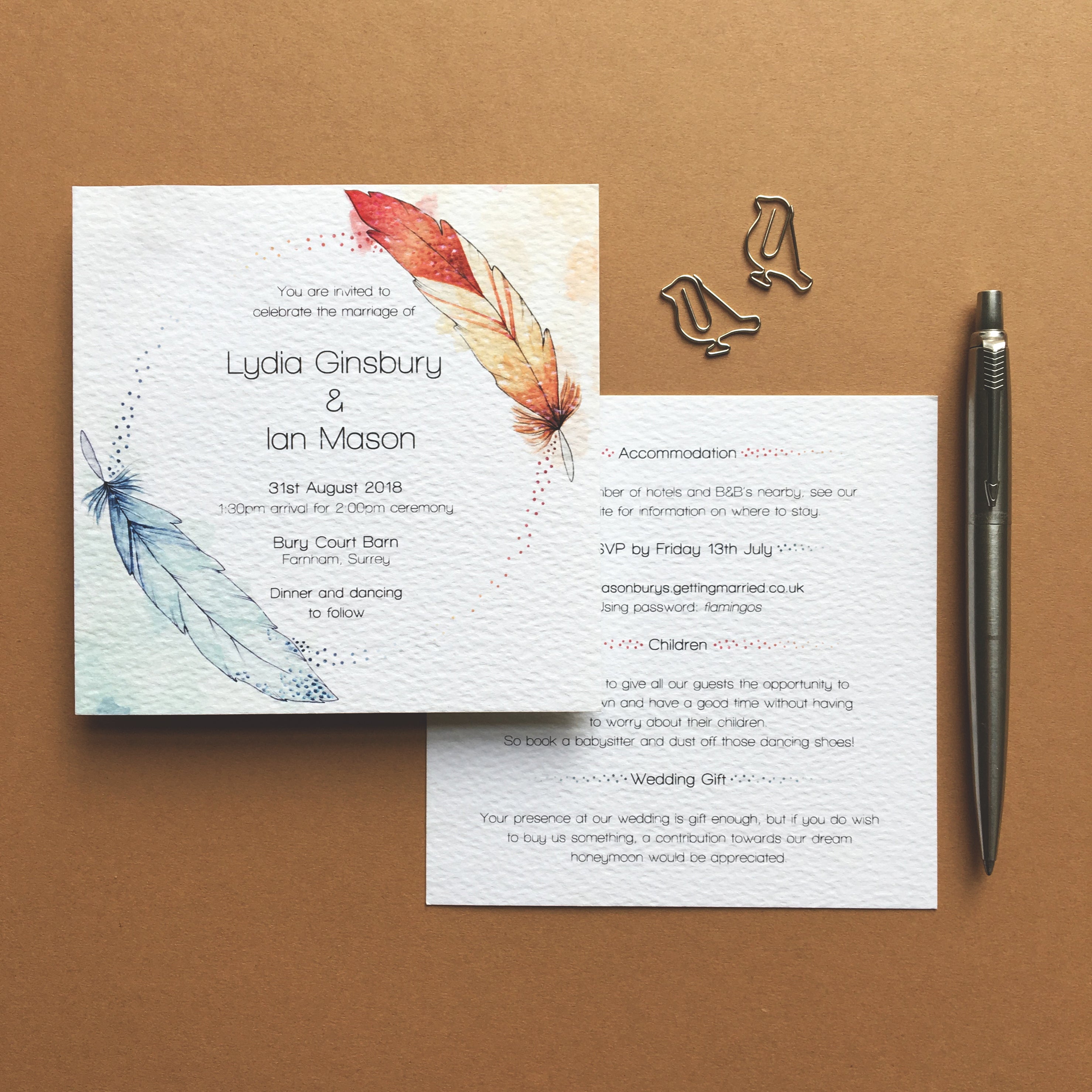
Throughout their wedding stationery, Ian and Lydia had the theme of birds across their suite, starting with their invitations that featured two colourful feathers and the separate sheets were held together by bird shaped paper-clips.
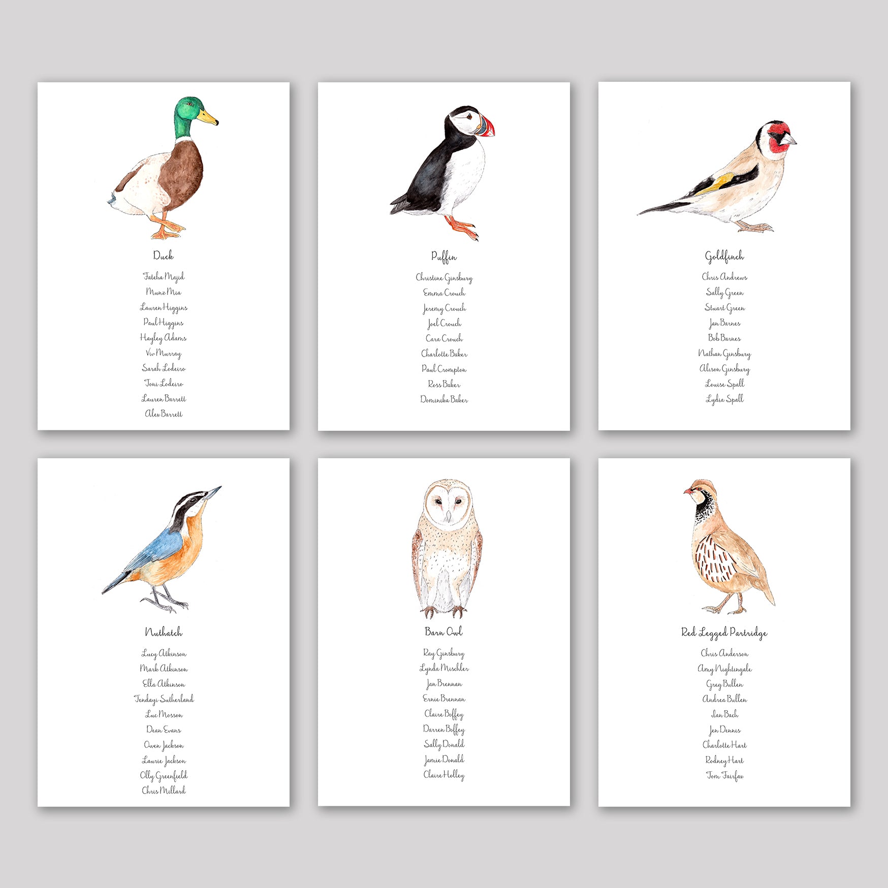
The theme for their table plan was also birds, a different species for each of the nine tables, all painted using watercolours.
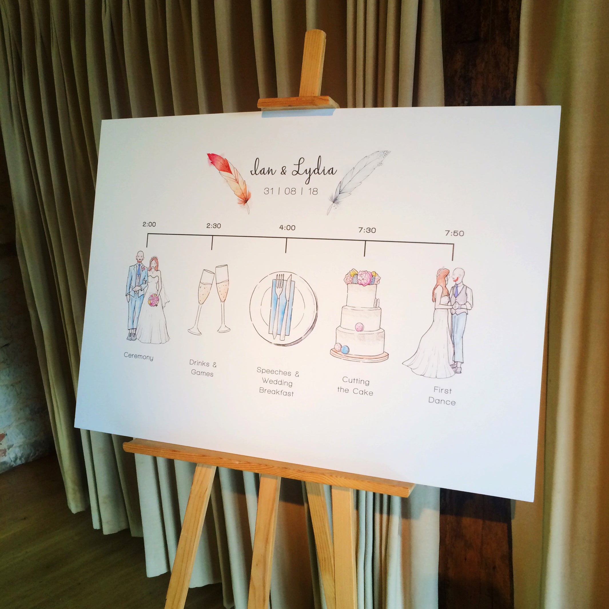
The final item of their stationery was a timeline of their day, which matched their colour scheme and included personal touches, such as the groom wedding suit trouser length, as requested.
Katherine & James
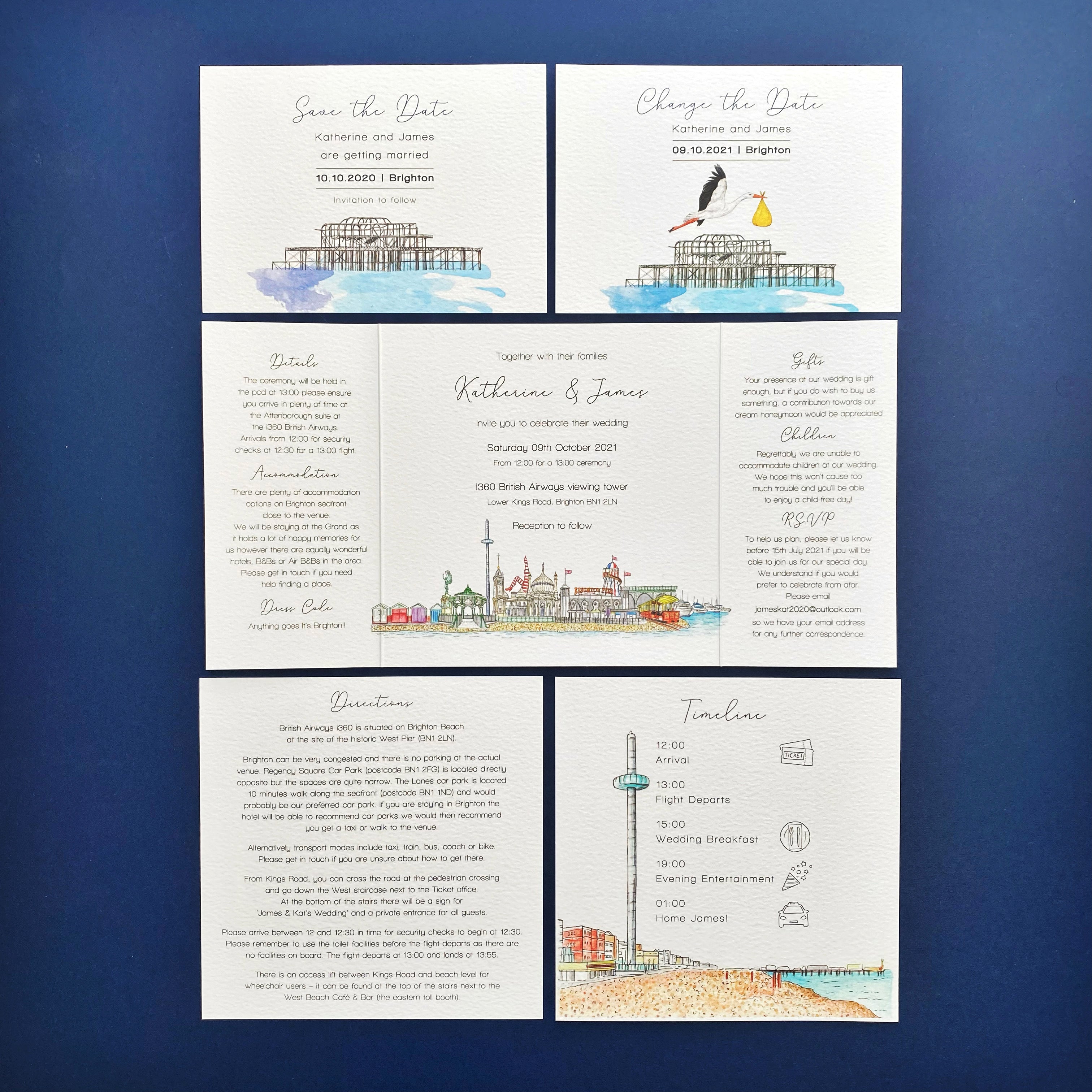
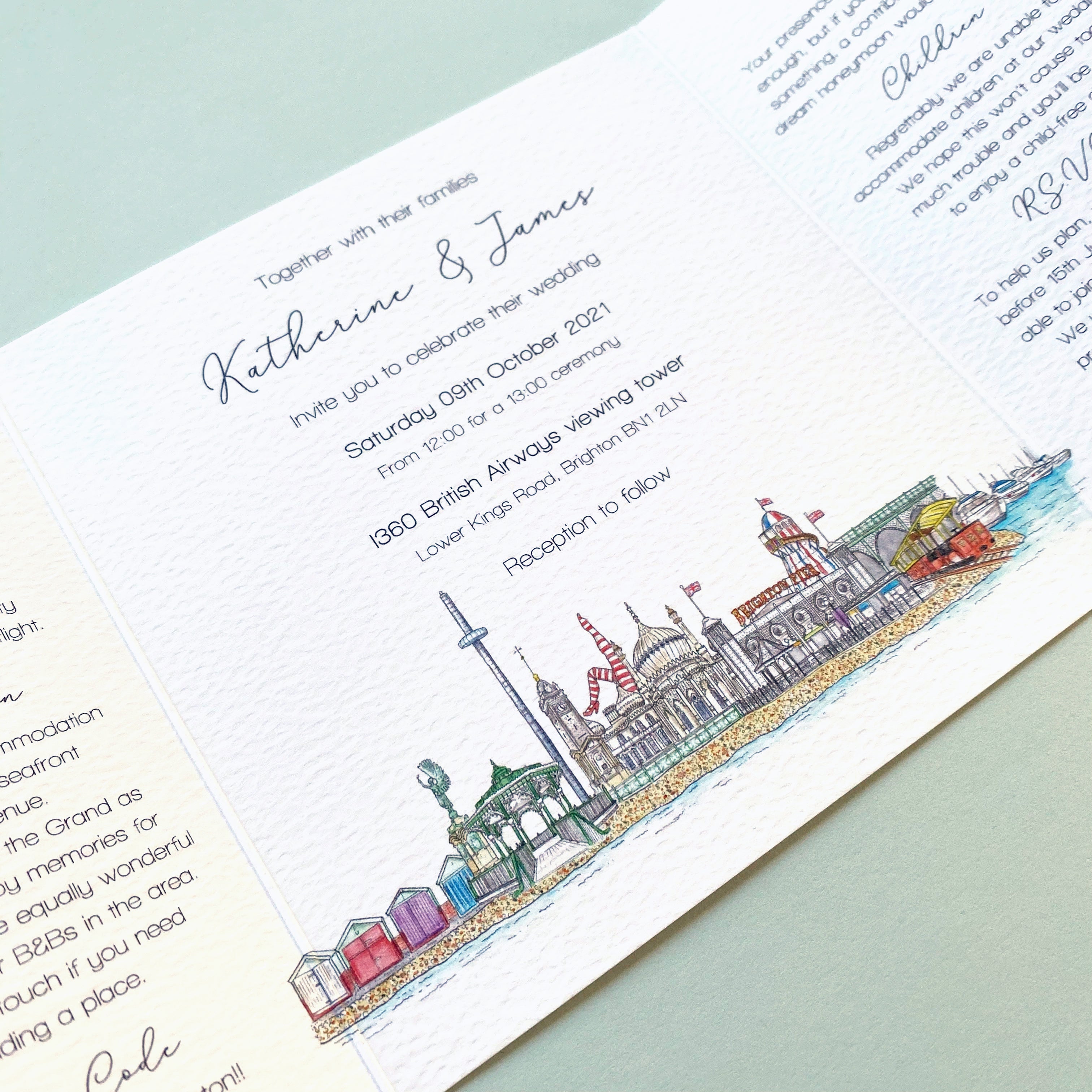
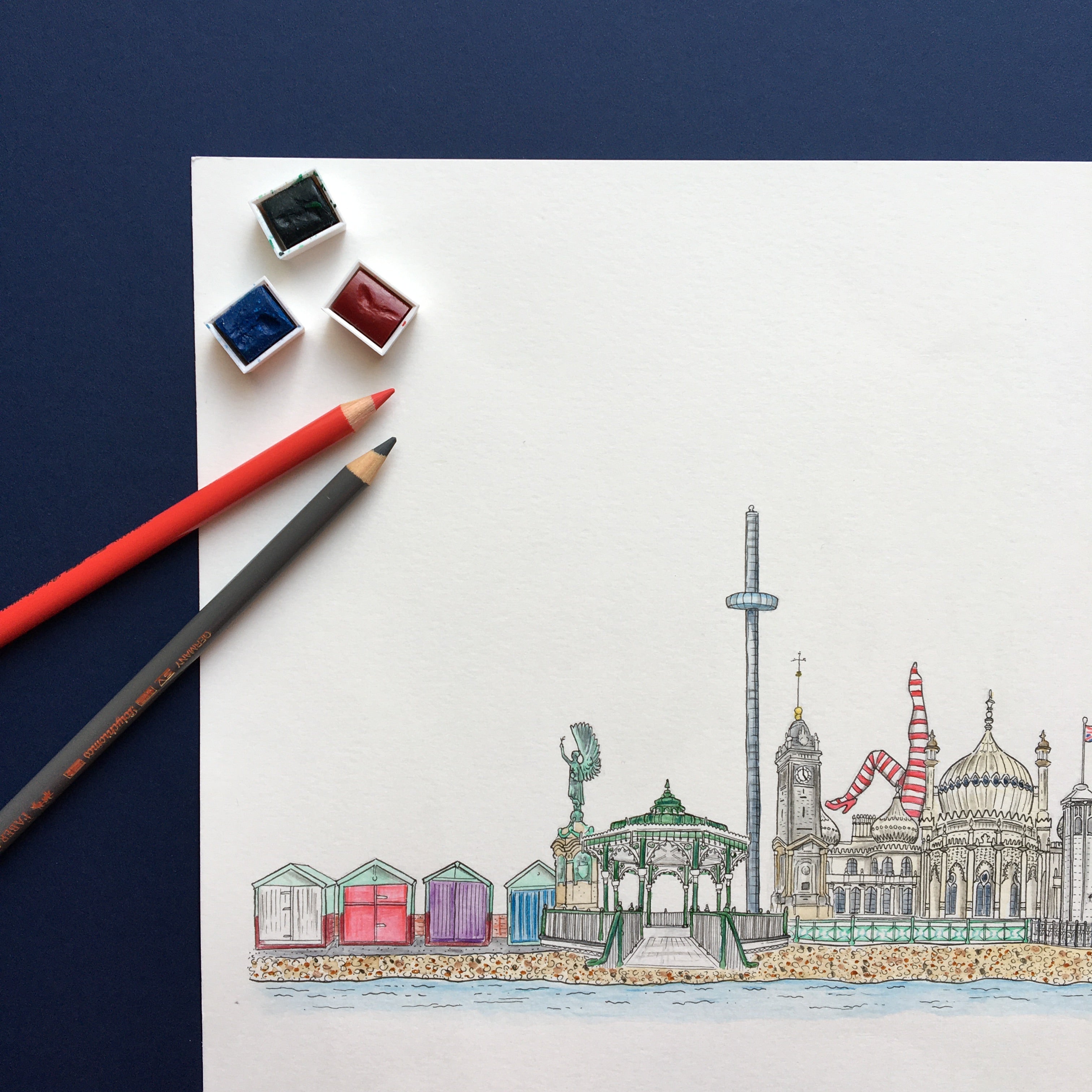
Brighton themed wedding stationery suite design, featuring original illustration of famous local landmarks, including the pavilion bandstand and the Brighton pier.
This suite included a Save the Date and a Change the Date/Baby announcement and the final gate-fold invitation and information/timeline card. I also created on the day stationery, include a Welcome Sign and an illustrated table plan, featuring illustrations of the couples favourite holiday destinations.
All of the illustrations were hand-drawn, using pen, watercolour and pencil and the final designs were professionally printed on a textured paper, to enhance the hand-drawn quality of the artwork.
Kim & Murray
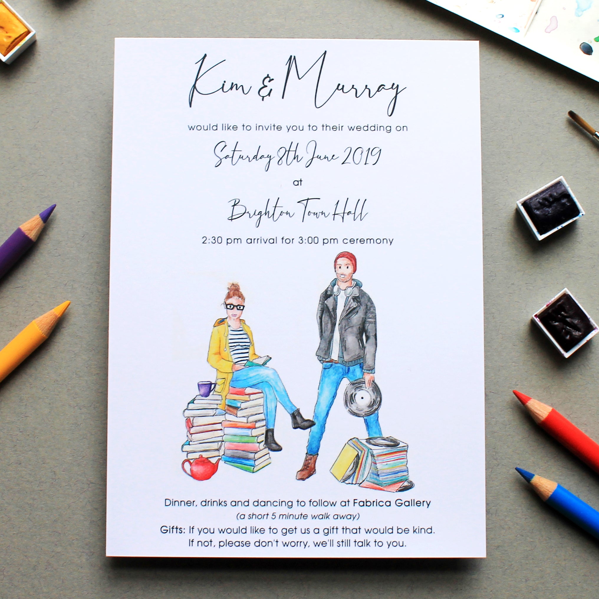
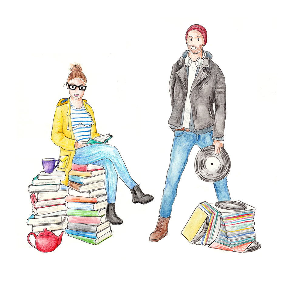
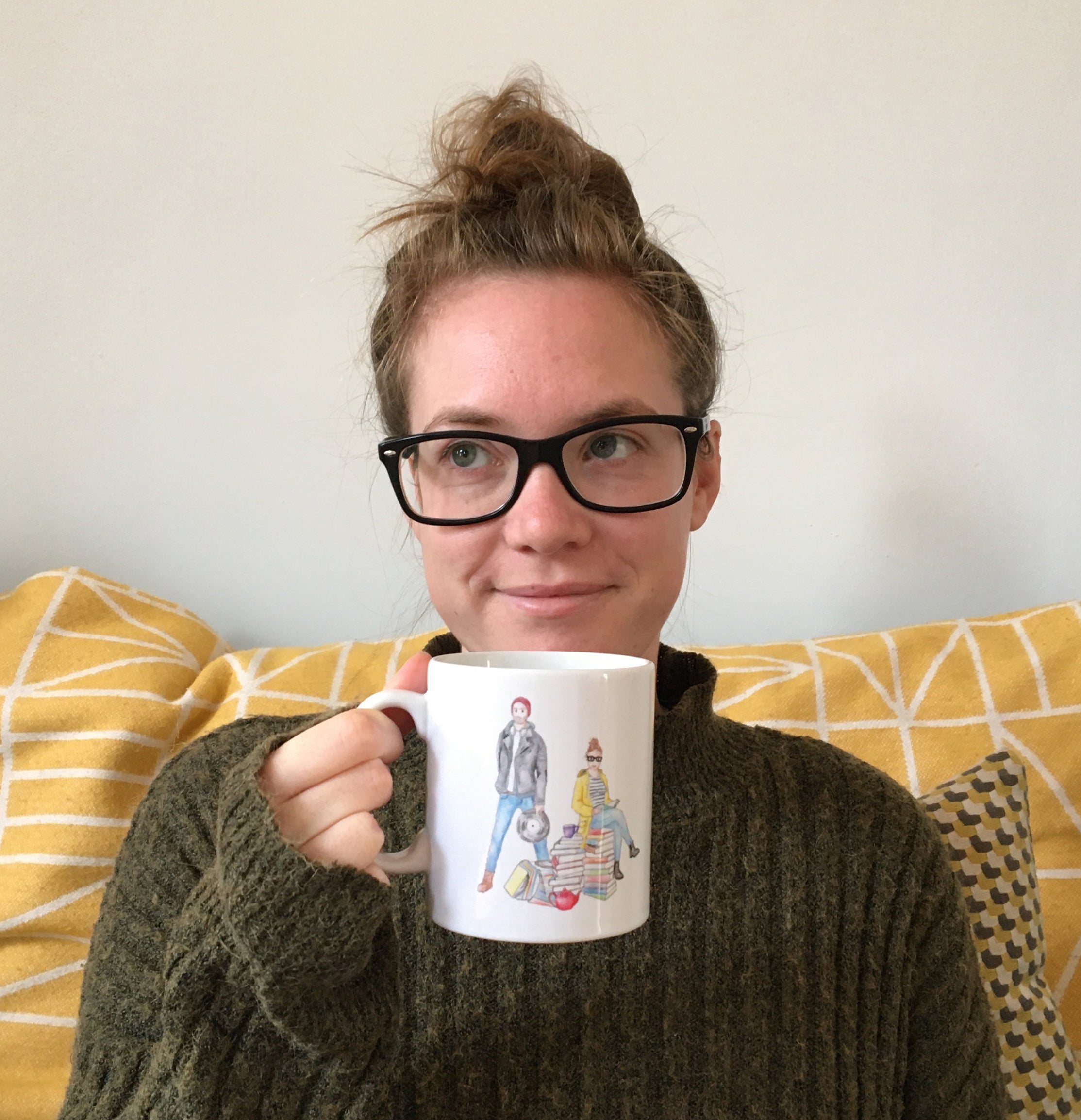
For Kim & Murray's wedding invitations, the inspiration was Quentin Blake's Matilda at 30 illustration, with her as an adult, sitting on a pile of books.
Kim loves to read and drink tea and Murray loves his music, so with this in mind and knowing the outfits they a most known for wearing I created this playful character illustrations of them.
They were used for the Invitations, Table Plan and finally on the wedding favours for the guests, that were mugs with the detail of the wedding on, modelled here by the bride herself.
Hannah & Will
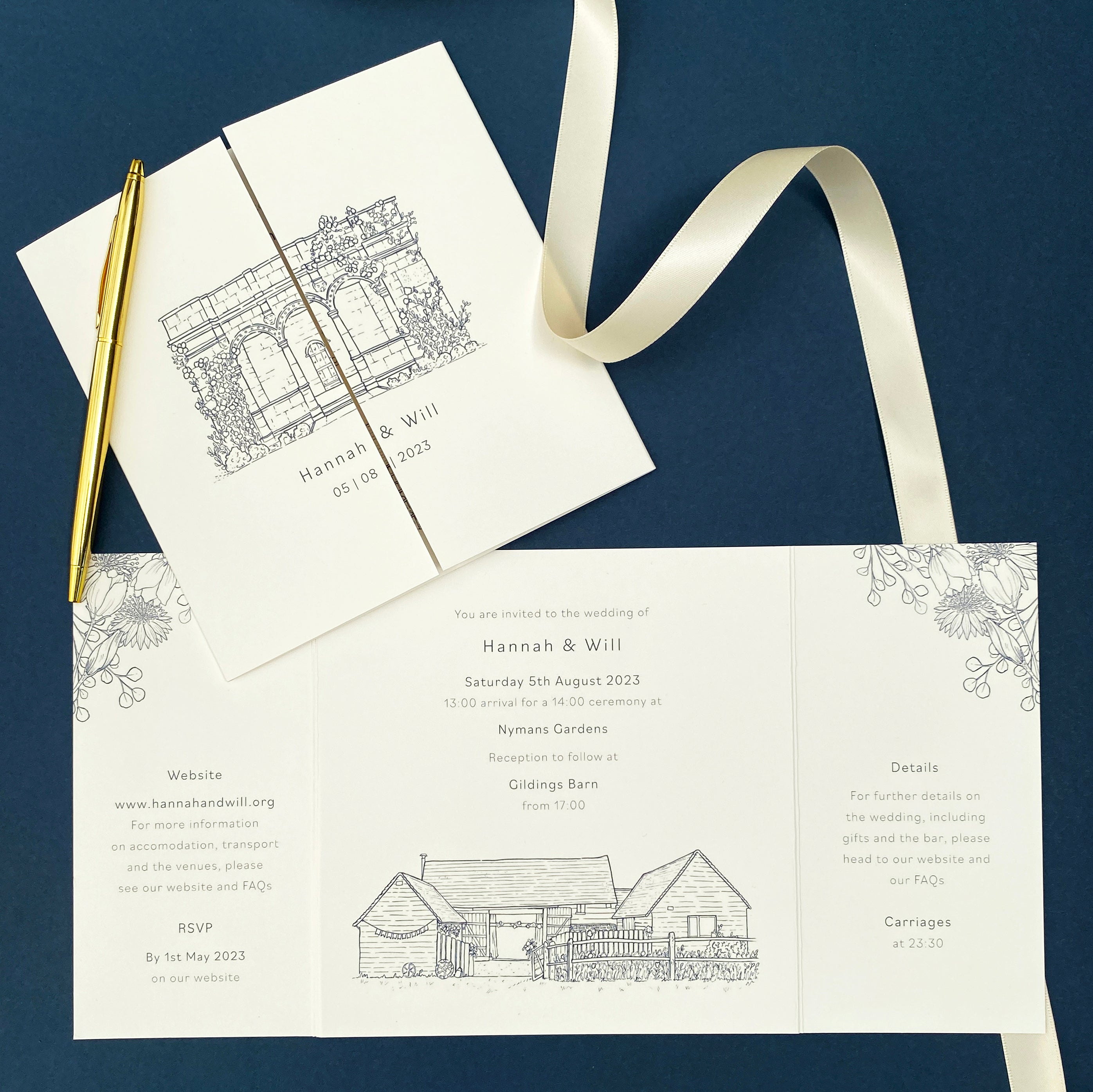
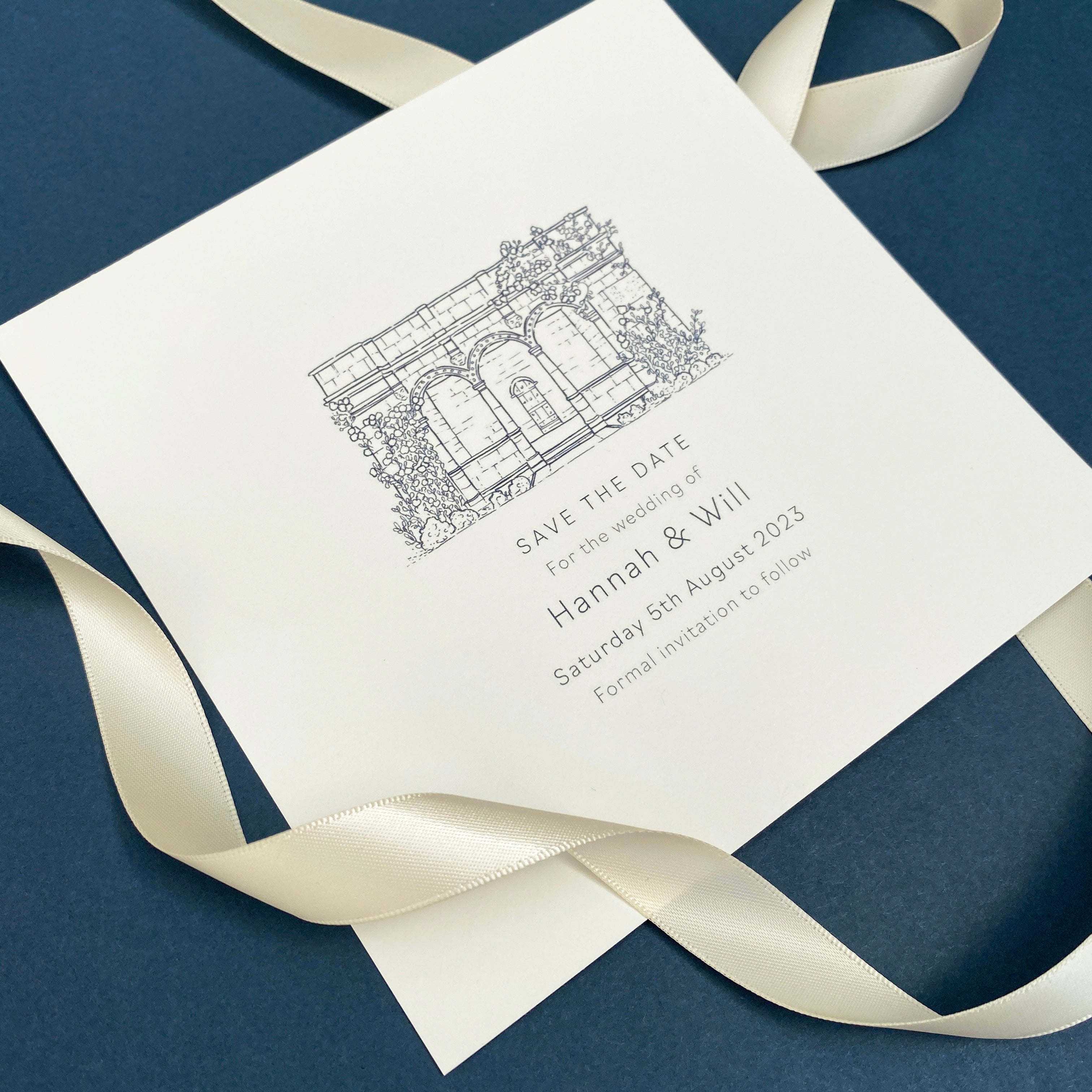
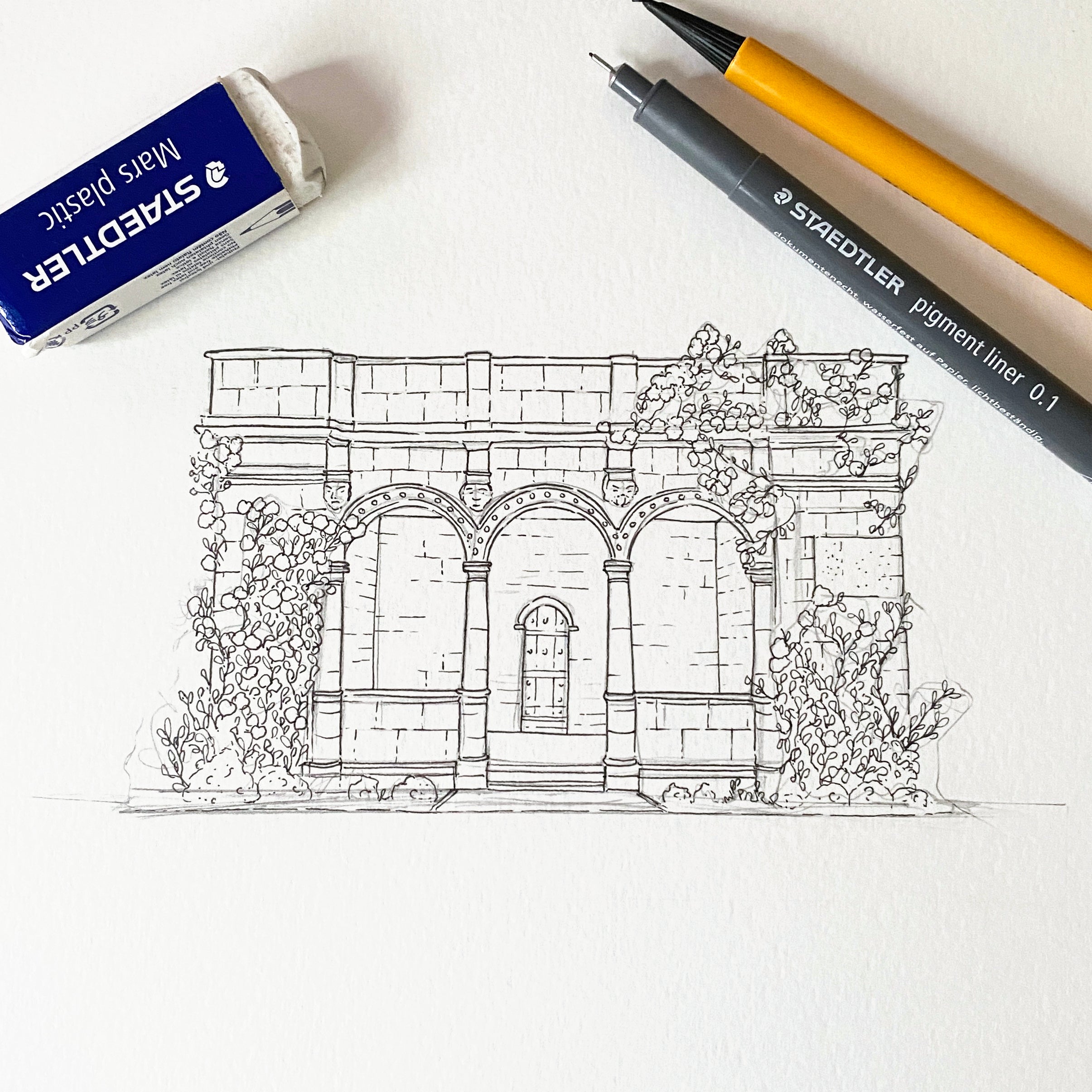
Hannah & Will wanted a clean and stylish design for their wedding stationery, opting for a simple line illustration of the two venues for their ceremony and reception, to be used across their Save the Dates and Invitations.
These illustration were drawn using fineliners before being digitised. I then applied the shade of blue from their wedding colour scheme as an overlay so that it fit in with their theme and paired it with the wording they wanted included.
The flower illustrations were also drawn using finaliser and used across the matching day stationery, including a Welcome Sign, Table Plan and Guest Placecards.
Ben & Kathy
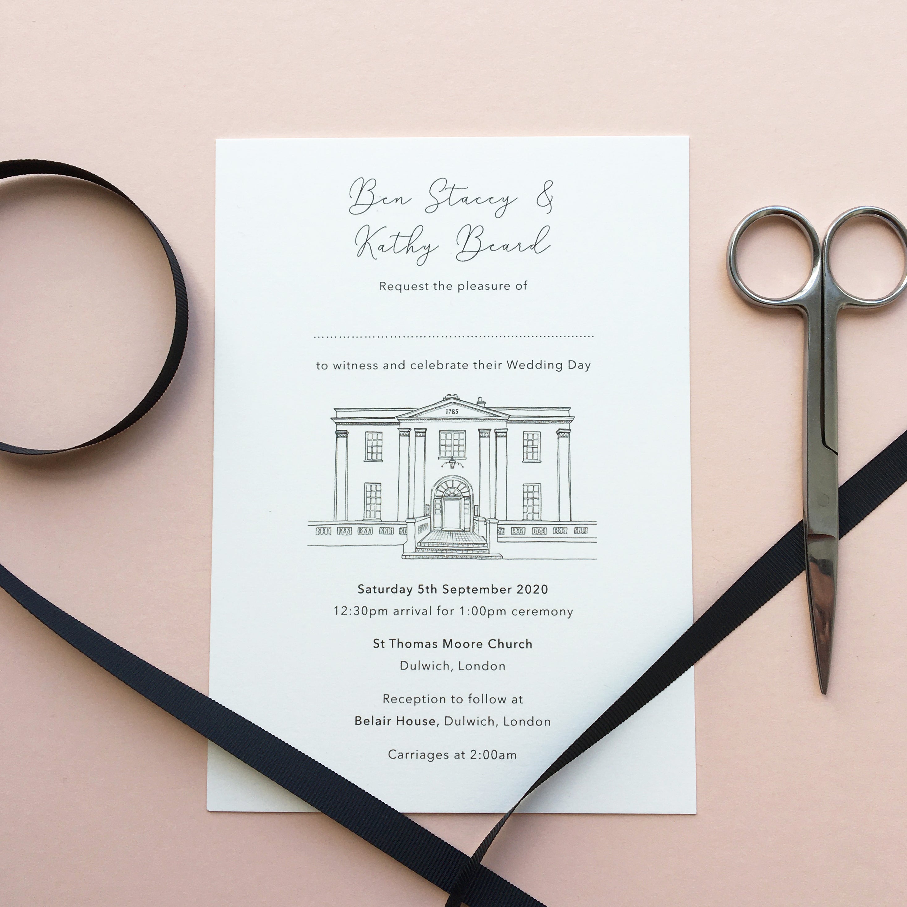
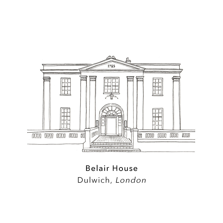
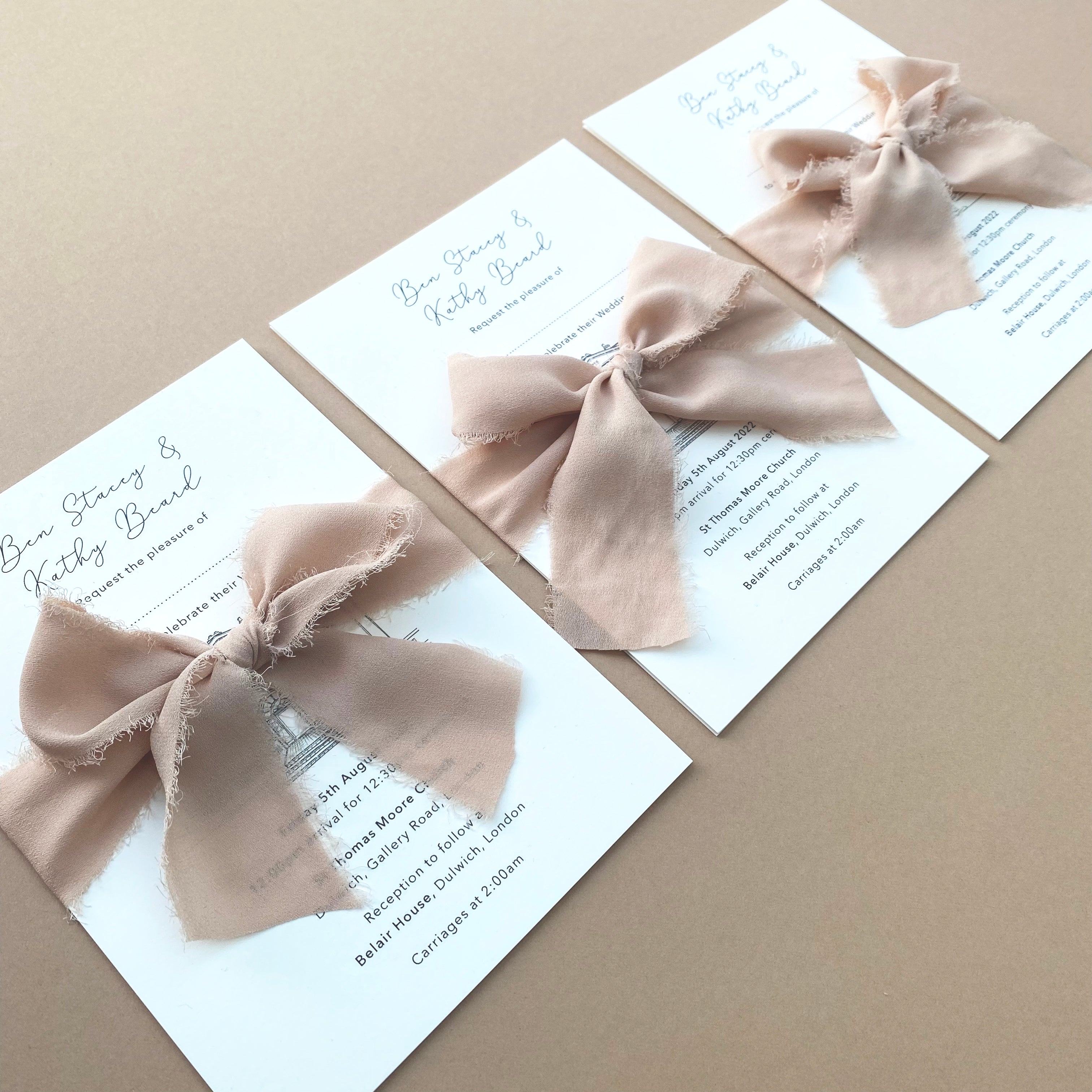
For their wedding invitations, Ben and Kathy wanted to classic, chic design, featuring a simplistic line illustration of their wedding venue.
As an extra flourish, they wanted the two sheets of their invites held together by a ribbon tied in a bow around the outside. For their initial invites they opted for a think black ribbon but when there wedding was forced to be rescheduled, they changed for a blush, chiffon material, for a more textured feel.
Their invites were printed on a think, smooth, off-white paper stock, that gives a classic, elegant finish.
Lauren & Ashley
